|
Financial Professionals Spring 2020
This is my quarterly missive intended primarily for my fellow financial professionals wherein I share items I have run across or thought about this quarter which I think might be beneficial to you. It’s really long (even more than normal) this time – you’d think maybe I was trapped at home with nothing to do! Nope, most all of this I accumulated in January and February. But perhaps you have more time right now to peruse it. Enjoy!
We currently have three consulting clients (RIA firms) and can accommodate two more. Firms look to us for guidance and to serve as a sounding board. For example, we are often a source of:
- Perspective in times of market volatility
- Counsel on new situations (TCJA, SECURE Act, negative interest rates, etc.)
- Expertise on tax-efficient investing (asset location, etc.)
- Solutions for valuing pension payout options and employee stock options
- Advice on asset allocations and portfolio implementation
The annual retainer for this is generally the square-root of your AUM – it’s on-brand!
For more details or to discuss further, please e-mail me or call 770-517-8160. – David
First, other than this item I’m not going to put anything below about the virus, the economy, tax changes that just passed, etc. Two reasons: 1) things are moving so fast it is likely to be outdated, and 2) you are all reading lots of stuff on it elsewhere. Here are the few things I think are worth sharing on those topics:
- Commentary on Congressional and IRS actions is everywhere, there is much less state tax deadline information. Here is a source for you.
- Dr. Ioannidis is a renowned debunker of faulty analysis (seminal work here). He recently released an article on the virus.
While I respect Dr. Ioannidis and we do need much better data, I do not think his estimates are correct. If, in fact, this virus was similar to the flu then the original doctor in China would not have noticed anything amiss and (more significantly) the situation in Italy wouldn’t be as dire.
By the way, I assume the investment research we all read and rely on is just as problematic. But he is a serious scientist, so I thought this was worth sharing.
- We really don't have good data: Where does all the heterogeneity come from?
- The world has changed since 1918, but the lasting effects of the flu that year are surprising. See this and this also.
- The contrasting responses of cultural vs. economic “elites” are interesting and I had never considered this. Very short, but insightful.
- Venture capitalist (and deep thinker) Paul Graham just posted this which is really about predictions, but it is an excellent observation.
Second, this is written about doctors, but applies to most of us.
Third, an article recently in the NYT Magazine on avalanche school had a portion that I think applies to investing:
Ryan identified McCammon’s six decision-making or “heuristic” traps. (Per McCammon: “Most of the time, the consistency heuristic is reliable, but it becomes a trap when our desire to be consistent overrules critical new information about an impending hazard.”) The traps that interested me most, because they were traps against which I was typically guarded — and so was happy to have them validated as species-wide frailties rather than personal quirks — were Familiarity (failing to remain vigilant when faced with the known), Social Facilitation (everybody’s doing it, so it must be O.K.) and Expert Halo (the experts must know what they’re doing, and so it’s safe to unquestioningly follow them).
The others are Consistency (or “commitment” — every moment you don’t turn around for home, it becomes harder to do so), Scarcity (powder fever) and Acceptance (peer pressure). The broad solution, Ryan said, to avoiding all heuristic traps is group decision-making, constant communication and the regular practice of emotional vulnerability.
I think most of those could be identified in the dot-com bubble of the late 1990s and the real estate bubble of the mid-2000s. What danger are we missing today?
Fourth, perhaps this will get fixed in a technical correction, but in the meantime if you have someone making deductible IRA contributions and doing QCDs simultaneously there is an issue.
Fifth, I keep seeing articles about how Tesla is more valuable than Ford or GM and now articles about how it is more valuable than both of them combined. This is not true. The EQUITY value of Tesla is higher because they can’t borrow on attractive terms because the firm is so risky. Total Enterprise Value (TEV) is the correct measure here. Here are the TEV figures from International Business Times (I haven’t verified the figures, but they seem plausible to me) recently: “Based on TEV, Ford would be worth $154 billion and GM, $132 billion, according to Factset data. On the other hand, Tesla’s total enterprise value comes to just $92 billion.”
I ended up doing some more digging. I don’t usually focus on individual securities but TSLA is fascinating. Barron’s had an article that mentioned TSLA market cap is up to $135 billion market cap and they hope to produce 500,000 cars per year. It occurred to me to divide: that’s $270,000 per car per year. That seems excessive so I grabbed data off the internet to see what the other manufacturers numbers are (using data from here and here) and made a little table:
Company |
Market Cap |
#Manufactured |
Cap/Car |
Tesla Inc |
$134,800,000,000 |
197,517 |
$682,473 |
Daimler AG |
$50,400,000,000 |
350,360 |
$143,852 |
Toyota Motor Corp |
$233,200,000,000 |
2,522,458 |
$92,450 |
Honda Motor Co Ltd |
$47,100,000,000 |
1,604,561 |
$29,354 |
General Motors |
$48,100,000,000 |
2,934,742 |
$16,390 |
Nissan Motor Co Lt |
$22,900,000,000 |
1,611,951 |
$14,206 |
Ford Motor Company |
$32,400,000,000 |
2,490,175 |
$13,011 |
It’s even worse than it looks because this is just the market cap. The TEV/car comparison would look much worse because the other manufacturers have much more debt in their capital structures (as mentioned above).
Even if they hit their goal – and you assume they should have higher per car figures because the cars are more expensive than a Honda or whatever – $270,000/car is still almost double Daimler – which has expensive cars.
Sixth, conservation easements continue to be abused, and the IRS is struggling to shut them down.
Seventh, two good short examples of excellent service, here and here.
Eighth, some interesting research on gender differences in saving came out.
Ninth, information on avoiding Medicare surprises here.
Tenth, a study came out that got a fair amount of press (“Being wealthy adds nine more healthy years of life, says study” for example). The actual study is here. While the data is sensational (as are the headlines), remember that smoking and obesity levels are highly correlated with wealth. Other research has shown that it is those factors, not wealth or poverty, that causes the disparity.
Eleventh, I saw this chart in January:

I’m not crazy about that chart, but it depends on what you are trying to show. It shows the size of the economy very well, but IMHO:
- It should be on a log scale because it misleadingly (to lay people) implies faster growth recently and growing X% from a small base will look worse than that same X% from a larger base.
- It should be per capita because the number of people matters. If the US annexed Canada then GDP would immediately be much larger, but that doesn’t mean “the folks” are doing any better.
Recently there has been much touting of questionable statistics from both parties about the economy and the growth under the current president and his immediate predecessor. For that purpose a chart like that is useless, so I thought I would take a look at per capita real growth, but there are a number of confounding issues:
- If you add doctors vs. laborers to the workforce over time you will get different effects. Over time the population is becoming more educated (on average) so you would expect the growth rate to increase.
- If you have more non-workers (retirees, children, stay-at-home parents, etc.) it will be lower. The tailwind of women entering the (paid) workforce is largely played out now.
I can’t correct for those issues, but we can simply look at GDP per capita and put it on a log scale to see what we can see. I made a chart in Excel with this data but someone else posted an equivalent one to the internet, and it’s easier for me to use that rather than format and upload mine:

Whatever your political persuasion, it’s pretty clear that after the “Great Financial Crisis” growth is noticeably slower, and seems the same regardless of political administration. The minor chart crime above is that the origin is omitted, but with a log scale and large numbers you really have to. Using my data, the growth rate is 2.19% per year and is 99.6% correlated with the log per capita GDP through 4/1/09 (i.e. it’s the best fit line through that date – using 10/1/07 would improve the rate by just 2 bps). The recent growth rate (from when the line drops) is 1.63% (from 4/1/09 to 7/1/19).
So, I don’t know what’s happening, but the real per capita growth rate of the U.S. is about 82 bps lower since 4/1/09 than it was from 1/1/47 to that point. The only thing I can think of that might explain that is the consistent entry of more women into the (paid) workforce; perhaps substantially all of the women (on a percentage basis) who were going to be employed already were by 2009 so that source of economic growth stopped.
Twelfth, a few good quotes I ran across recently:
Diversification for investors, like celibacy for teenagers, is a concept both easy to understand and hard to practice. – James Gipson
A strategy should be judged in terms of its quality and prudence before, not after, its outcome is known. – Nassim Taleb
I am indeed rich, since my income is superior to my expenses, and my expense is equal to my wishes. – Edward Gibbon (author of The History of the Decline and Fall of the Roman Empire)
Baron Rothschild is often quoted as saying “the time to buy is when there’s blood in the streets.” But the full (supposed) quote is better: “Buy when there’s blood in the streets, even if the blood is your own.”
Also, I have updated my collection of quotes about money and investing, found here.
Thirteenth, the recent decline in interest rates is perhaps merely the continuation of a 700 year trend:

Related, there is a great post on this here and the underlying paper is here.
Fourteenth, some lessons from Japan.
Fifteenth, good article on value and momentum here. In addition, The Valuesberg Address is very funny. And Larry Swedroe wrote, Is There Something Wrong with the Value Premium?
Sixteenth, Judy Shelton’s nomination is in the news again (here and here). Last year I noticed her blatant stupidity in pandering to Trump (who as a serial borrower loves low interest rates) and emailed this to a few folks:
Judy Shelton was featured in the WSJ last weekend and said something so dumb I was amazed. I didn’t think it worth sharing at the time, but now she’s more significant [she was being mentioned as a possible Fed nominee]. Here’s the quote that stunned me:
“Money should not reward wealthy investors, who can borrow vast sums on margin, at the expense of ordinary savers who earn next to nothing on their bank accounts.”
Did you catch that? She’s implying that rich people are net borrowers and poor people are net savers!
Seventeenth, I continue to see covered call writing mentioned as though it is a prudent or conservative investment strategy. It isn’t. Recently a financial advisor mentioned in a professional forum they used it as part of their fixed income allocation!
That scares me and (IMHO) should scare you too.
Covered call writing is a risky strategy. Folks don’t think so because:
- The CFP exam considers (or at least did a few years ago, I don’t know about now) it a conservative strategy. (They are, or at least were, wrong.)
- The promotors (wholesalers) provide misleading information (it’s only “low-beta” because the upside is absent, the downside is perfectly correlated).
- People are anchoring off of an equity position. In other words, it is safer than straight equities (downside plus call premium is ever-so-slightly better than downside without call premium), but that certainly doesn’t mean it’s safe.
I’m going to attempt to describe this two ways, first I’ll describe the graph (since I don’t want to take the time to make one), and second I’ll use simple math. This applies whether you are talking about a single stock, an index, or whatever. Let’s call the underlying investment X.
Picture explanation: The distribution of expected returns of X is a bell curve as I’m sure you can picture in your mind. The portfolio of X with call options written on X is the same bell curve but shifted to the right (because you get the call premium) and with the right side of the distribution truncated (you get called away). In other words, you only have the left side – the one with all the risk! This is a strategy with extreme negative skew and should absolutely not be analyzed with metrics (like beta and standard deviation) that assume a normal distribution of returns.
Math explanation: Assume X pays no dividends and has a current price of $50. We’ll also use a six month period just as an example. If you wanted to get the upside of X with an option you would buy a call with a strike price of $50 that expires in six months. If you wanted to own the downside of X you would sell a put (this seems nonsensical to want, but stay with me for a moment) with a strike price of $50 that expires in six months. So if you both bought a call and sold a put you would have the upside and the downside, but you would be missing the “no change” part of owning the stock. So you could also buy a t-bill at a discount that will mature with a value of $50 in six months. What we have just done is replicated all the possible stock outcomes without owning the stock itself:
S = C - P + T
Where S is stock (or the underlying whatever), C is a call on S with a given maturity and a strike price equal to S, P is a put on S with the same maturity and strike price as the call, and T is a t-bill worth S at that same maturity date.
In our example, whatever the value of the stock would be in six months, the value of C - P + T (long call, short put, long treasury) would be also.
The cools thing about that formula is that you can rearrange it using nothing more than junior high school math. So, for example, if you have a really tight collar (you sell all the upside to hedge all the downside on X) you merely get treasury returns:
S - C + P = T
In other words, there is no free lunch. You can rearrange the distribution of returns but there is no return without the risk.
[Nerdy aside: When you have just one item on one side of the equation, the other side is known as a synthetic security. This is also why put-call parity exists. Since you can build a put out of calls: P = C + T - S, and a call out of puts: C = S + P - T if the value of one is too high or low you can sell or buy and hedge with the other positions. So, for example, if calls were too expensive, you could sell them short and hedge the position by being long the stock, long a put, and short treasuries and just pick up the mispricing as a riskless arbitrage return. This is why the prices are always basically right, lots of computers on Wall Street are looking for the tiniest arbitrage opportunities that can be exploited net of transaction costs because it’s a free lunch. So that free lunch doesn’t really exist for folks who aren’t high speed traders.]
So, back to our original issue, covered call writing is exactly the same as owning a portfolio of treasuries and writing naked call options on the stock (or the index, or whatever). In other words:
S - C = T - P
A portfolio of long treasury bills and short put options on a stock or index would be considered insanely risky by most advisors (these types of strategies are also colloquially known as “picking up pennies in front of a steamroller”), but it is exactly the same as long stock and short calls!
Eighteenth, I thought these asset manage translations were funny.
Nineteenth, the U.S. has a very messed up real estate sales process.
Twentieth, loss harvesting was much more relevant a few weeks ago, and the first portion of this is well known, but the replacement of the replacement security is, I think, novel analysis. This issue was raised because many of us loss harvested for clients last December and then had the replacement securities increase dramatically in value in January. And then it just (mostly) happened again. This is a good thing! But then what should be done?
Loss harvesting analysis in the form of questions and answers (it gets more interesting at as we go):
- Should loss harvesting be done in taxable accounts? Yes, when the losses are economically meaningful. Previously, a multi-period analysis was important because of transaction costs. Now that transaction costs are trivial that is less important.
- When should it be done? Again, when losses are economically meaningful. Most advisors wait until year-end but that is sub-optimal. Since on average investments have positive returns, losses should be harvested when they exist since the harvesting opportunity is likely to disappear.
- What should be done with the proceeds of the sale? There are two options:
- Wait in cash until the wash sale period ends. This is what it appears most advisors do but this risks missing returns by being in cash. Of course those returns could be negative.
- Purchase a replacement security that is in the same asset class, but not “substantially identical” (which would trigger wash sale rules).
Since returns are (on average) higher to be invested than not (otherwise the portfolio should never be invested), purchasing the replacement security is the better bet (though momentum weakens this argument).
- When should the original investment be repurchased? There are three possible outcomes during the wash sale period:
- The investment is little changed – this is the most likely result and the replacement securities can be sold and the original holdings repurchased with little or no tax impact.
- The investment is down – the replacement securities can be sold, generating another tax loss, and the original holdings repurchased. While this is bad for the portfolio, it is good for taxes.
- The investment is up – if this is true then selling the replacement security will generate a short-term capital gain. What should be done depends on the investment returns in the future (which are, of course, unknowable). Here are the possible outcomes:
- The investment is flat – then the gain could have been taken after the gain becomes long-term.
- The investment is down – then the gain becomes a loss and we are back to the situation above, where another loss can be harvested from the replacement security.
- The investment is up – this is the most likely outcome, and (depending on how much up) it is generally better to take the gain in the replacement security ASAP to get the future gains allocated to the long term holding (the original holding).
That last portion (you have a short-term gain in the replacement holding) is where this gets complicated. The advisability of the sale of a security with a short-term gain is a function of:
- The size (in percentage terms) of the short-term gain.
- The expected return difference between that security and its replacement. In the case of a loss harvest this difference should not be large.
- The expected return during the period before it becomes long term.
- The long term capital gain rate.
- How long the position will be held.
- The opportunity cost of paying taxes now vs. later.
Assuming you would swap back to the original security after either one month (wash sale period) or one year (for long-term gain), then mathematically, you pay the difference between the long-term and short-term rates on the one month gain, to defer the long-term rate on the 11 month gain for X years (until the security would have been sold). I did not analyze staying in the replacement security. That is a different analysis where you would need to consider the expected difference in returns on the two securities.
An example, the numbers aren’t really important, I just made some up to do the math. Assume:
- A $1,000 investment.
- A 38.8% LT rate
- A 23.8% ST rate
- A 10 year holding period (i.e. this position is expected to be held that long)
- The return during the one-month period was approximately 10%
- The return during the next 11 months was 8%
- Tax rates don’t change during the holding period
- Taxes are paid from other funds
- Solve for opportunity cost/hurdle rate
What cost of capital (aka opportunity cost or hurdle rate) would you need to break even?
- PV = -((38.8% - 23.8%) * 10% * $1,000) [i.e. you pay today the difference in rate on the 10% return on $1,000] = $15
- N = 10
- FV = $1,000 * (1.10) * 8% * 23.8% [i.e. you pay later the long term rate on the 8% made on the original investment including the one month return on the investment] = $21
- I = 3.4%
In other words, paying $15 “extra” now on the one month of gains, let’s you pay the gain on the next eleven months 10 years from now instead of now. If you can earn at least 3.4% on your money, that is a good deal.
We can generalize this into a formula:
Hurdle rate = (((1 + one month return) * eleven month return * LT tax rate) / (one month return * (ST tax rate - LT tax rate)))^(1/holding period) - 1
Alternatively, I may want to solve for the eleven-month return:
Eleven month return = (((1 + hurdle rate) ^ N) * one month return * (ST tax rate – LT tax rate)) / ((1 + one month return) * LT tax rate)
Or you may want to solve for the holding period which would require logarithms. This is getting complicated so I built a spreadsheet (e-mail me if you would like a copy).
I don’t have a general recommendation on what to do, but now we at least have a calculator to play with in thinking about it.
Twenty-first, an advisor asked me recently how bonds did in the 2008 downturn. The answer, of course, is very well. The fourth quarter of 2008 saw returns of -30% on the S&P 500, but -1% on the Agg, positive 5% on intermediate treasuries, and 9% on long-term treasuries.
BUT, while recent history has a negative correlation on stocks and bonds, that was not true in the more distant past. If the correlation is negative going forward that would argue for a larger allocation to bonds as they are a hedge (not just a diversifier) to stocks. In fact, it may be that bond yields are so low (in part) because they are now a partial hedge on stocks. Investors should be more willing to pay (through lower yield) for that hedge.
But… if you look at at a graph of rolling correlations of stocks (S&P 500) to various bond indices you can see we clearly had a regime change in the late 1990s. Also, the visibly lower period in the late 1980s is all attributable to the -22% return on stocks in October 1987 vs. 4%, 3%, and 7% on the Agg, intermediate treasuries, and long treasuries respectively. Without that one-month drop the correlation looks like they would have averaged about 45% through 1999. Since then it has averaged about -25%.
The best explanation of the difference (exposition here) may be that if there are issues in the bond market that will propagate to the stock market and correlations are thus positive. But if there are problems in the stock market the ensuing “flight to safety” of bonds means the correlations become negative. Since there is no way to know which problem will occur in the future (and the situation is way more complicated than this simple sketch too) betting on continued negative correlations seems aggressive. To me at least.
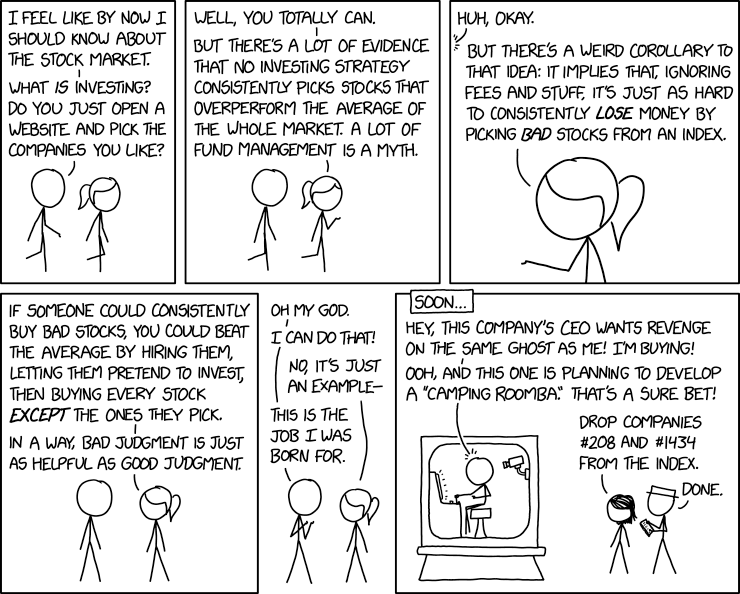
Twenty-second, this comic from the excellent XKCD is actually true (and funny). The difference between games of skill and games of luck are that games of skill are easy to lose on purpose.
Twenty-third, ESG/SRI investing continues to be popular. I have long believed ESG/SRI investing is effective for virtue signaling (by the client or the investment advisor), but it is extremely (and perhaps utterly) ineffective for either improving the risk/return profile of a portfolio or making the world a better place.
I also suspect this one of the things I shouldn’t say (the essay at that link is outstanding and well worth your time).
Here are four papers on it. The general conclusion is that if something is popular, the expected returns are low and ESG/SRI are popular. Here are what I take to be the key portions of the abstracts:
Is Exclusion Effective? by David Blitz and Laurens Swinkels
“Excluding firms with the worst sustainability profiles boils down to a transfer of ownership. It is not obvious how this is supposed to lead to changes for the better in society. We challenge the effectiveness of four frequently used arguments in favor of exclusion policies: increasing a firm’s cost of capital, pushing a firm out of business, improving investment performance, and signaling stakeholders to change behavior.”
The Contributions of Betas versus Characteristics to the ESG Premium by Rocco Ciciretti, Ambrogio Dalò, and Lammertjan Dam
“Firms that score low on environmental, social, and governance (ESG) indicators exhibit higher expected returns. … A one standard deviation decrease in ESG scores is associated with an increase of 13 basis points in monthly expected returns. This study also sheds new light on how the term structure of the ESG premium has changed over time.”
Sustainable Investing in Equilibrium by Lubos Pastor, Robert F. Stambaugh, and Lucian A. Taylor
“In equilibrium, green assets have negative CAPM alphas, whereas brown assets have positive alphas. Green assets’ negative alphas stem from investors’ preference for green holdings and from green stocks’ ability to hedge climate risk.”
Is Socially Responsible Investing a Luxury Good? by Ravi Bansal, Di (Andrew) Wu, and Amir Yaron
“[W]e consistently find that ‘good’ stocks significantly outperform ‘bad’ stocks during good economic times, e.g., periods with high aggregate consumption and market valuation but underperform during bad times such as recessions. This is consistent with a wealth dependent investor preference that is more favorable toward SRI during good times, resulting in higher temporary demand for SRI – similar to time-varying shifts in the demand for luxury goods.”
See also Cliff Asness on ESG.
Twenty-fourth, given the market turmoil, I thought I’d take a look at gold since it is a “store of value” (supposedly). Since I was grabbing data I put spot oil on the FRED graph also. I adjusted both for inflation (i.e. the values are real not nominal). As you can see here, even without considering storage or insurance costs, both have had a negative real return for about the last 40 years. But that’s cherry picking the worst spot. Since 1968 spot gold is up 3.3% annualized and oil is up 1.8% annualized (both in real dollars). Based on the data, there is a 95.2% chance that the real return on gold is not zero (82.3% for oil) but I still am not inclined to buy it, that multi-decade drawdown is scary!
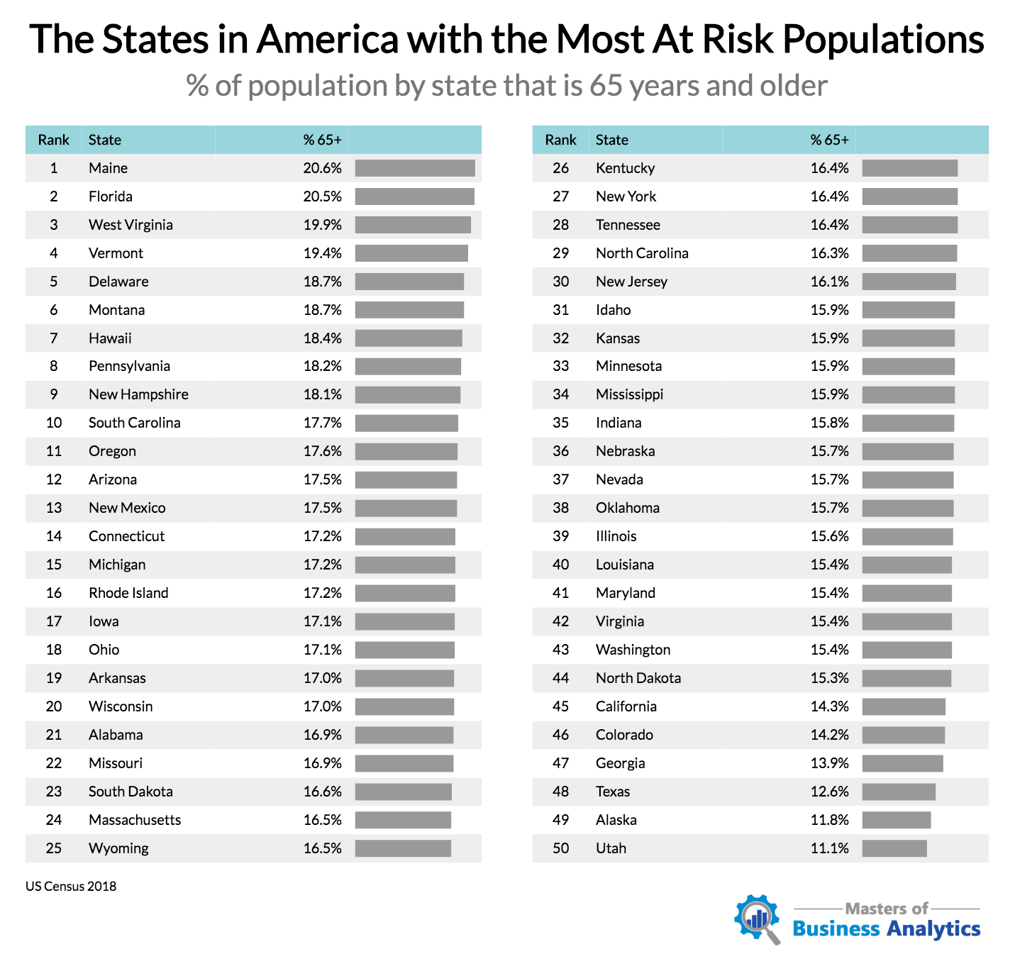
Twenty-fifth, I did not realize the population of Maine was older than Florida, or how (relatively) young Georgia was:
Twenty-sixth, the Credit Suisse Global Investment Returns Yearbook 2020 Summary is out (as is the actual Yearbook, of course). See the press release here for good summary. Here are a few tidbits:
“Since 1900, global equities have outperformed bills by 4.3% per annum.”
“Prospectively, the authors estimate that the equity risk premium will be 3.5%, a little lower than the historical figure of 4.3% …”
“With real interest rates around zero, the expected return on stocks is just the equity risk premium.”
“Over the 120 years since 1900, equities have outperformed bonds, bills and inflation in all 21 countries. For the world as a whole, equities outperformed bills by 4.3% per year and outperformed bonds by 3.1% per year.”
“However, after adjusting for non-repeatable factors that favored equities in the past, the authors infer that investors expect a global equity premium (relative to bills) of around 3½% on a geometric mean basis and, by implication, an arithmetic mean premium of approximately 5%.”
“The Yearbook shows long-run returns on five factors that have exhibited premiums both over the long-run and across countries, namely, size, value, income, momentum and low volatility.”
“The value style has performed poorly in recent years, and this continued in 2019, albeit with some glimmer of hope from late summer. In the USA, value stocks have now underperformed growth stocks over the last 31 years.”
I’ll also add a few more observations here that perhaps will be useful (figures from the paper):
- If you are using MCS (Monte Carlo Simulation) or other stochastic tools (and you should be!) in your planning, you do not want to use “conservative” figures. The MCS gives you useful outputs only if the inputs are accurate. You should strive for your best estimates and, then, if you seek conservatism, implement a plan that has a higher probability of success. In other words, better to use solid inputs and seek a 95% chance of success, than to use “conservative” inputs and then settle for an 80% chance of success (and you don’t know the success, you just know it’s higher than 80 because you fudged your figures).
- You should not use historical figures blindly. History is a great guide to what can happen (how bad it can get) but a terrible guide to what will happen. Current expected returns on asset classes are frequently different from history. If you insist on using historical data, I implore you not to select the data from one of the best historically-performing countries – which went from 15% of world market cap to 55% of world market cap – and assume that return is what you or your clients should expect going forward. Historical real global returns were 5.2% on stocks and 2.0% on bonds (both geometric). Even those returns are probably too high to assume going forward (ignoring any further evidence from current valuations) because:
- Investing is safer now. Read some financial history about the wild west that was the markets before there was an SEC (and the Fed). Since investing is safer now than historically, ipso facto the returns should be lower.
- Capital is more abundant now. Remember your supply/demand curves from economics? If something is more abundant the price should be lower. Expected returns are the price of capital.
Twenty-seventh, from 1926-2019 if you invested in the S&P 500 the average annual return (geometric) would have been 10.2%. If you invested in five-year treasuries it would have been 5.1%.
What if you were the luckiest investor ever (or I guess you could be the most skillful) and every calendar year you switched to what was going to be the winner? Your portfolio would have grown at a 17.0% rate.
But what if you were the worst investor ever and always picked the loser for the year? Negative 1.0%
Surprising, isn’t it?
Twenty-eighth, simplify! “Simple Systems Have Less Downtime”
Twenty-ninth, some humor from the internet as we all quarantine ourselves:
Treat your 401(k) like your face – don’t touch it.
I’m socially distancing from my portfolio.
A stock market crash is worse than a divorce, you lose half your money and your spouse is still around.
Day 2 without sports. Found a lady sitting on my couch. Apparently she’s my wife. She seems nice.
Your grandparents were once called to war. You are being called to stay home and sit on your couch. You can do this America.
Ironically, J.C. Penney is now a penny stock.
Thirtieth, I saw this article (and others like it) about responses to the SECURE act and the recommendations are atrocious. Here are six significant problems with a taxable account holding non-dividend paying stocks until death vs. a Roth:
- If you need the funds before death, you pay taxes on the taxable account not the Roth.
- The heirs get an additional ten years of tax-free growth on the Roth after death.
- You can’t rebalance the holdings (without paying taxes) in the taxable account.
- The investments are sub-optimal. Voluminous research indicates that:
- Value beats growth (on average over long periods of time, etc.) and non-dividend paying stocks are generally growth stocks, but even if that weren’t true,
- A portfolio that has all options available is always superior to one that doesn’t. I.e. a restricted opportunity set is always worse than an unrestricted one, the question is only, “how much worse?” (This is the critical issue with ESG/SRI investment mandates.)
- How do you predict the future dividend policy of a company? (Remember, you can’t rebalance.)
- Ancillary benefits such as creditor protection, not being an eligible asset on the FAFSA, etc. are not available.
Finally, my recurring reminders:
J.P. Morgan’s updated Guide to the Markets for this quarter is out and filled with great data as usual.
Morgan Housel and Larry Swedroe continue to publish valuable wisdom. Just a reminder to go to those links and read whatever catches your fancy since last quarter.
That’s it for this quarter. I hope some of the above was beneficial.
If you are receiving this email directly from me, you are on my list of Financial Professionals who have requested I share things that may be of interest. If you no longer wish to be on this list or have an associate who would like to be on the list, simply let me know.
We have clients nationwide; if you ever have an opportunity to send a potential client our way that would be greatly appreciated. We also have been hired by some of our fellow advisors as consultants to help where we can with their businesses. If you are interested in learning more about that arrangement, please let us know.
We also offer a monthly email newsletter, Financial Foundations, which is intended more for private clients and other non-financial-professionals who are interested. If you would like to be on that list as well, you may edit your preferences here.
Finally, if you have a colleague who would like to subscribe to this list, they may do so from that link as well.
Regards,
David
Disclosure
|